Dear friends, honest music lovers,
As the release of our fifth studio album That’s Amore is almost due, we feel it is time to elaborate on the beautiful packaging that keeps the vinyl and compact disc warm & safe. For us it certainly is a design that fits the band in its’ current phase, including band vibe, musical style and lyrical message.
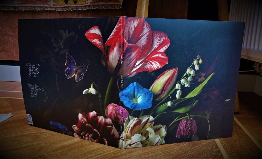
Let’s start with the evident eyecatcher: the flowery still life art that spreads around the front and back of the album. This is a genuine piece of modern art by Bas Meeuws, the Eindhoven based photographer of international fame.

Meeuws’ work caught the attention of our guitar player Mike some years ago when he got his hands on Meeuws’ excellent book “Flower Pieces”. While diving into the various atmospheres of Meeuws’ pieces of art, the idea of working together in the future took hold. During the time of writing, composing and arranging, the band reached out to Meeuws and he turned out to be a real music lover too. Also, Meeuws was familiar with BBR as he had seen the band live on several occasions! After listening to an early mix of the upcoming album, Meeuws started working out some ideas and constantly asking for feedback from the band. Via byways and detours Meeuws constructed the work ‘Untitled (#149)’. The colouring, composition and framing of this conceptual work really is an excellent fit for our vision of the new album: it combines inspiration from the heydays with a modern take on the art form itself. Anyone will notice the wink to the 17th century stylistic approach, while the technical side of Meeuws’ work makes it relevant in a contemporary way. Just like Meeuws, we want to pay tribute to the greats without being too nostalgic about it.

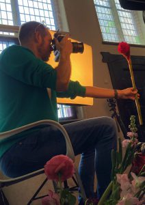
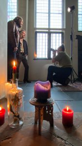
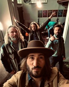
For the band portrait across the gatefold we approached Maaike Ronhaar, who you might know from her layered, atmospheric and conceptual photos that can be found online. Ronhaar and the band got to know each other when she was shooting live pics for several venues and online platforms. As you may know, a photoshoot can be a bit awkward and unsettling. That’s why we always love to work with people we have a connection with, such as the übercool photographers Mike Nicolaassen and Koen Rutten. Of course a new paparazzo can stir things up a bit and that’s what we were looking for. 🙂 We chose the oldest residential building of our hometown as an appropriate setting for the concept of this portrait: Besiendershuis. So that’s where we teamed up with Ronhaar and Meeuws – who showed to be very dedicated to the project – and took a day of trying out stuff in and outside Besiendershuis. Also we had a third photographer present at the venue, namely Yorick de Vries, the artistic director for the project as a whole. De Vries later on suggested the addition of a printed pvc sleeve, so Meeuws’ artwork isn’t disturbed by the lettering on the front cover. It is a nice fact to mention that De Vries screen printed each copy by hand. We feel grateful for the commitment and openness in which these three masterblasters took their job serious. This team is something else!

 So, now we have something new that’s very special to us in many ways. That’s Amore is sonicly our baby and we feel it is a visual attractive invitation into our world. The times we live in can use some positivity, according to us. Join the ride, take in some amore and spread it while you’re at it!
Cheers! Simon / Mike / Jaap / Mark


